UX Design - Design System - User Research - UI Design
UNIVERSAL ORLANDO digital experiences
Rewired digital journeys to clarify visitor intent from exploration to conversion.

Overview
Universal Orlando’s digital ecosystem spanned multiple parks, ticketing options, seasonal campaigns, and planning tools, but the experience lacked structural clarity. Visitors exploring the parks online often encountered fragmented information, overlapping promotional content, and unclear paths toward purchase.
The goal was to redesign the digital experience so discovery, planning, and ticketing felt seamless, intuitive, and confidence-building across devices.
I led UX strategy and experience design to reorganize the platform around user intent, reducing friction from curiosity to conversion.
TEAMMATES
Joshua Hearn, Chelsea Moriarty, Jeff Wagener
The Challenge
Visitors needed to:


Compare parks and ticket types


Understand limited-time offerings


Plan multi-day trips


Transition from search to purchase
However, the existing structure blended marketing content with utility tasks, creating cognitive overload and friction early in the decision-making process.
The challenge was to create a cohesive information architecture and design system that aligned with how real visitors think and plan.

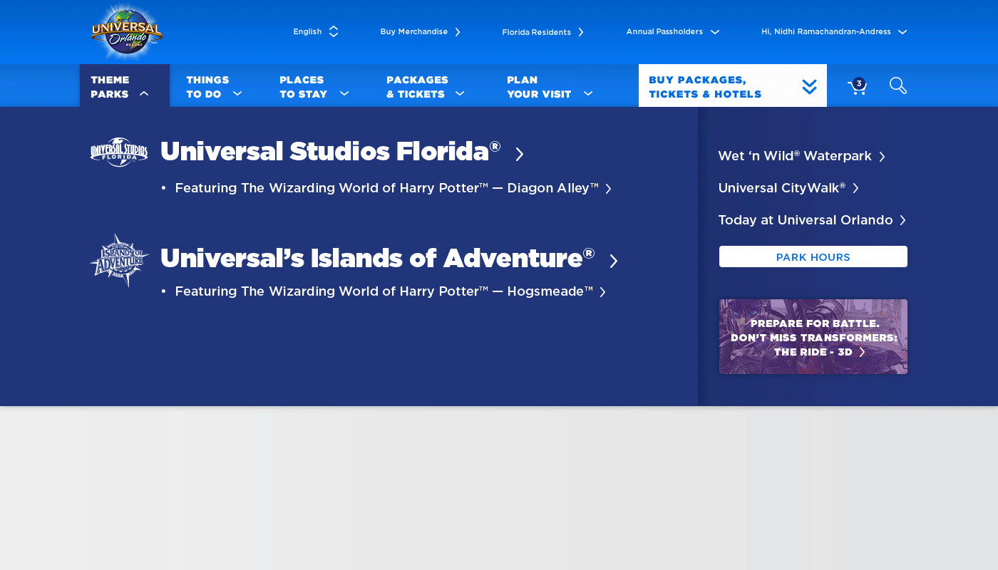
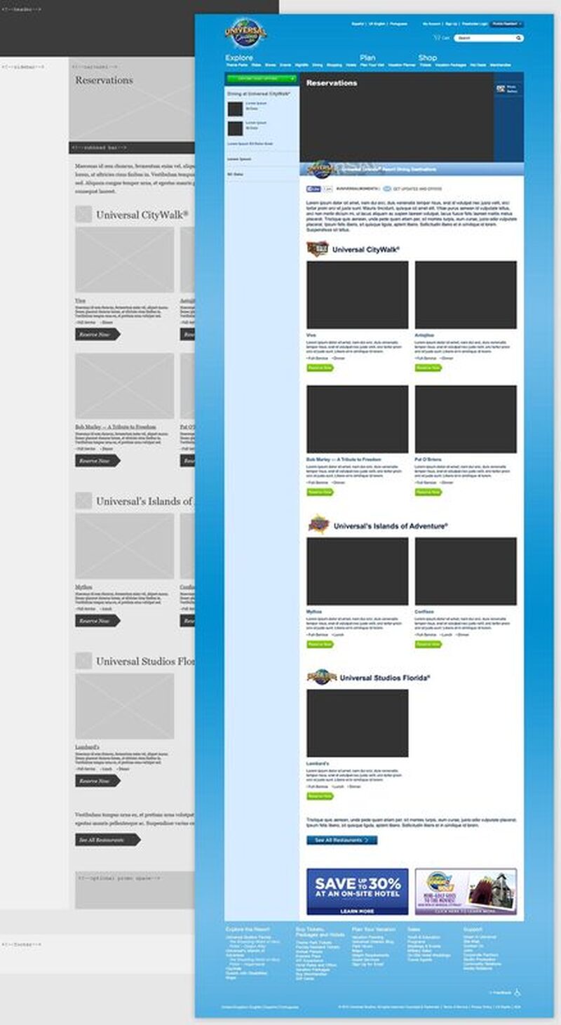
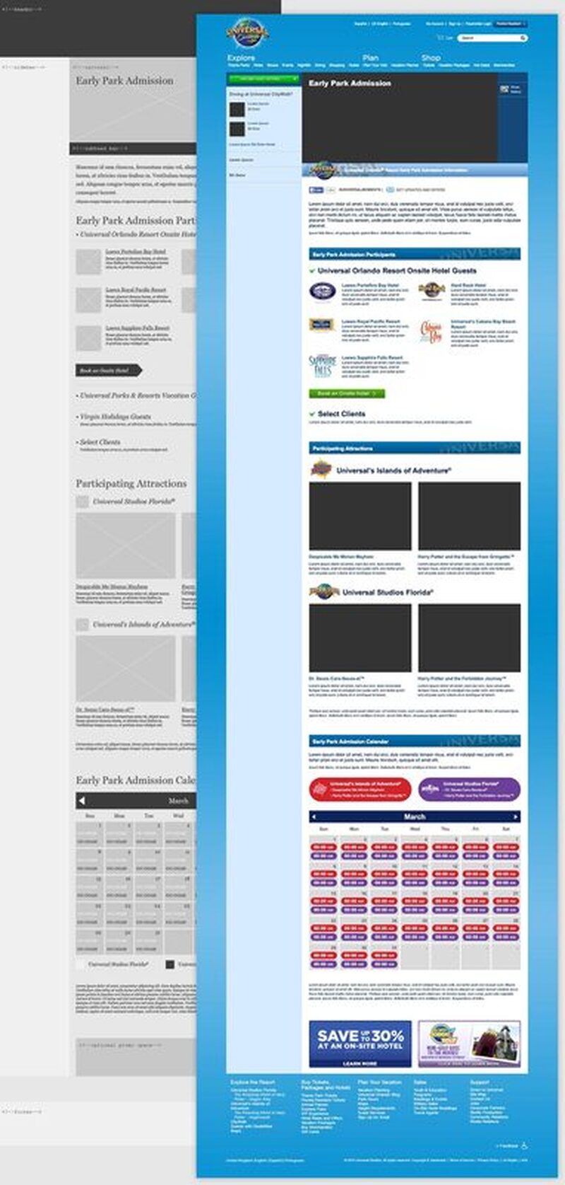
Revised navigation architecture for clearer intent paths.

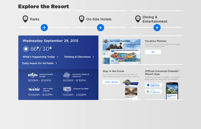
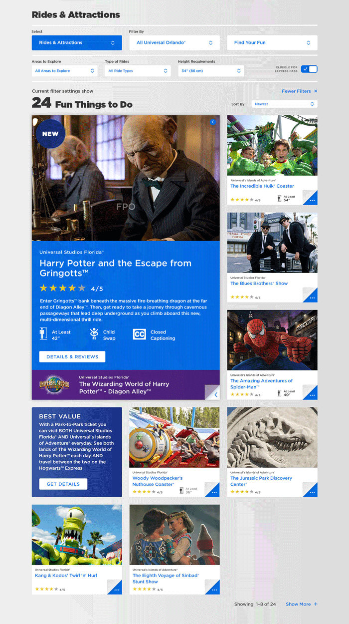
Modular page structure to support multiply numbers of content.

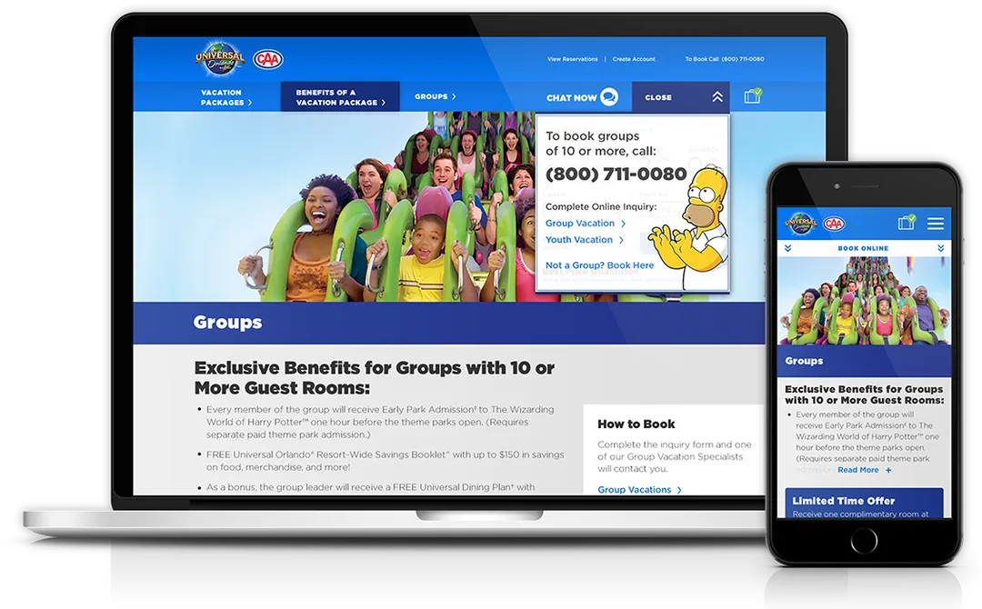
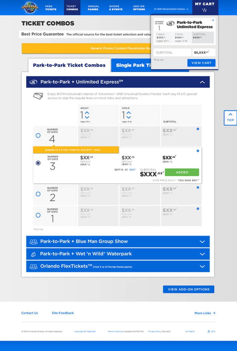
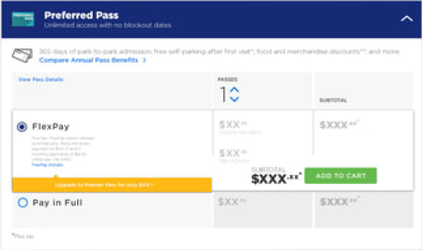
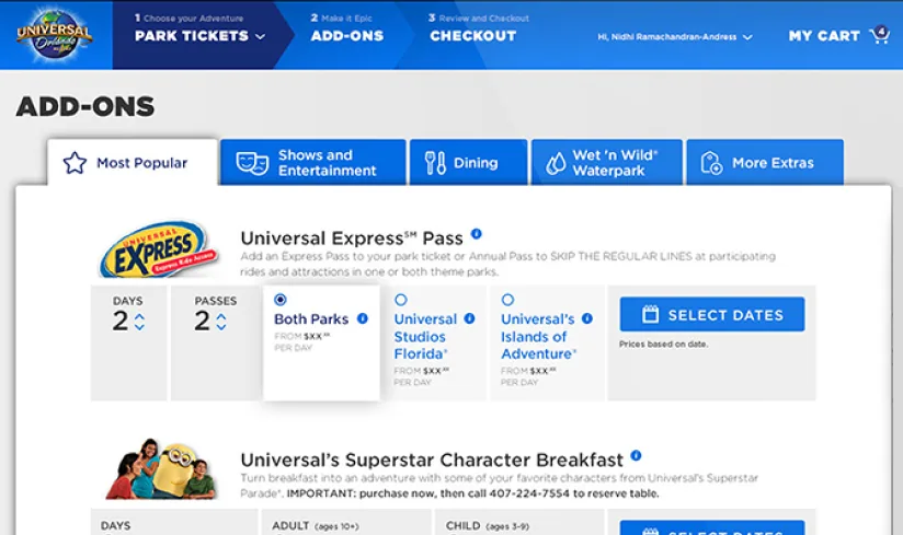
Ticket combo page flow from exploration to ticketing.
My Role
I served as UX Strategy & Design Lead, partnering with copywriters, clients, project managers, and development teams to:
|
Revise the complex ticketing system into easy to understand design |
|
Redesign navigation logic and users flows |
|
Designed modular design system components for scalabilit |
|
Lead responsive wireframing and interaction design |
Deliverables included:
- 1. Development of responsive wireframes
- 2. Creation of modular design components
- 3. Contextual micro-copy frameworks
- 4. Design of all website pages, email marketing, and digital assets
- 5. Execution of multiple quality assurance review rounds
- 6. Launch of a zero-to-one website
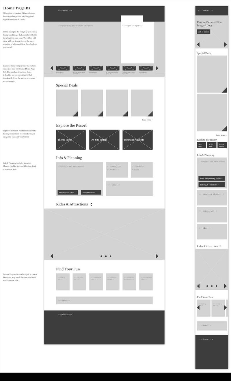
Wireframes and modular components and supporting assets for seasonal campaigns.
Research & Key Insights
A review of content, flows, and interaction patterns revealed several friction points:
- • Redundant and scattered ticket information across pages
- • Confusion between discovery content and actionable tasks
- • Inconsistent cross-device experience at high-decision moments
- • Multiple platforms are used for a single purchase path
Visitors needed structured pathways that matched their intent:


Design Strategy
To improve the user's flow, we decided to restructure the entire experience rather than refreshing pages in isolation. We focus on four main pillars:

Intent-Based User Flow
We reorganized navigation and content grouping based on clear mental models: "Explore Parks," "Plan Your Visit," "Compare Ticket Options," and "Purchase & Prepare."
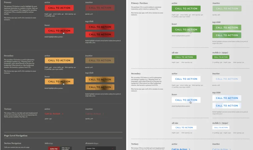

Modular Content System
To ensure scalability while maintaining structural integrity, we design a system that is flexible enough to accommodate any seasonal campaigns the park runs (Halloween Horror Nights, Mardi Gras, etc.).

Conversion-Focused Flow
We streamlined ticket comparison and selection pages to reduce ambiguity between options. Decision points were supported with contextual cues and micro-copy to guide users.

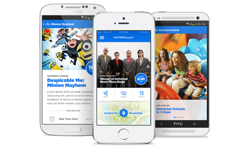
Cross-Device Continuity
We prioritized responsive behavior at critical planning stages, ensuring users could transition seamlessly between desktop and mobile during their journeys.
Impact & Outcomes
The redesigned experience improved structural clarity across the platform and strengthened alignment between marketing storytelling and functional planning tasks.
Post-launch observations indicated:
- Increased engagement on ticket comparison pages
- Improved path clarity toward purchase
- Reduced friction in early planning flows
- Greater stakeholder confidence in the long-term scalability of the platform
Most importantly, the digital ecosystem shifted from fragmented content to a user-centered experience.